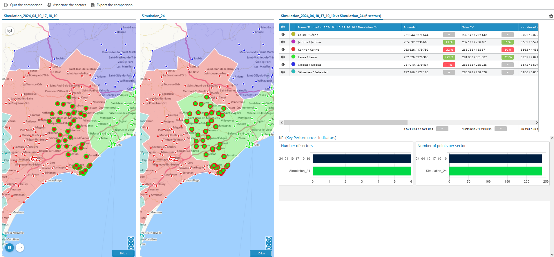
Two maps display on the screen, one for each simulation. Their respective names are displayed above their map. The geographic points or entities that have been reassigned are highlighted for easier interpretation. In the table you will find the indicators of simulations compared in a single column to estimate the impacts of modifications applied.


