The Wizard must be used to create any mapping web project, whether destined for use on a computer (classical web portal) or on a mobile terminal (portal for smartphones). The wizard consists of 6 steps enabling administrators and users with little experience of web development tools to be guided when constructing a mapping project. The steps are as follows:
- give the project a name,
- choose the general style of the portal (graphic style),
- import the data making up the portal,
- define the ordering of the layers of the future portal,
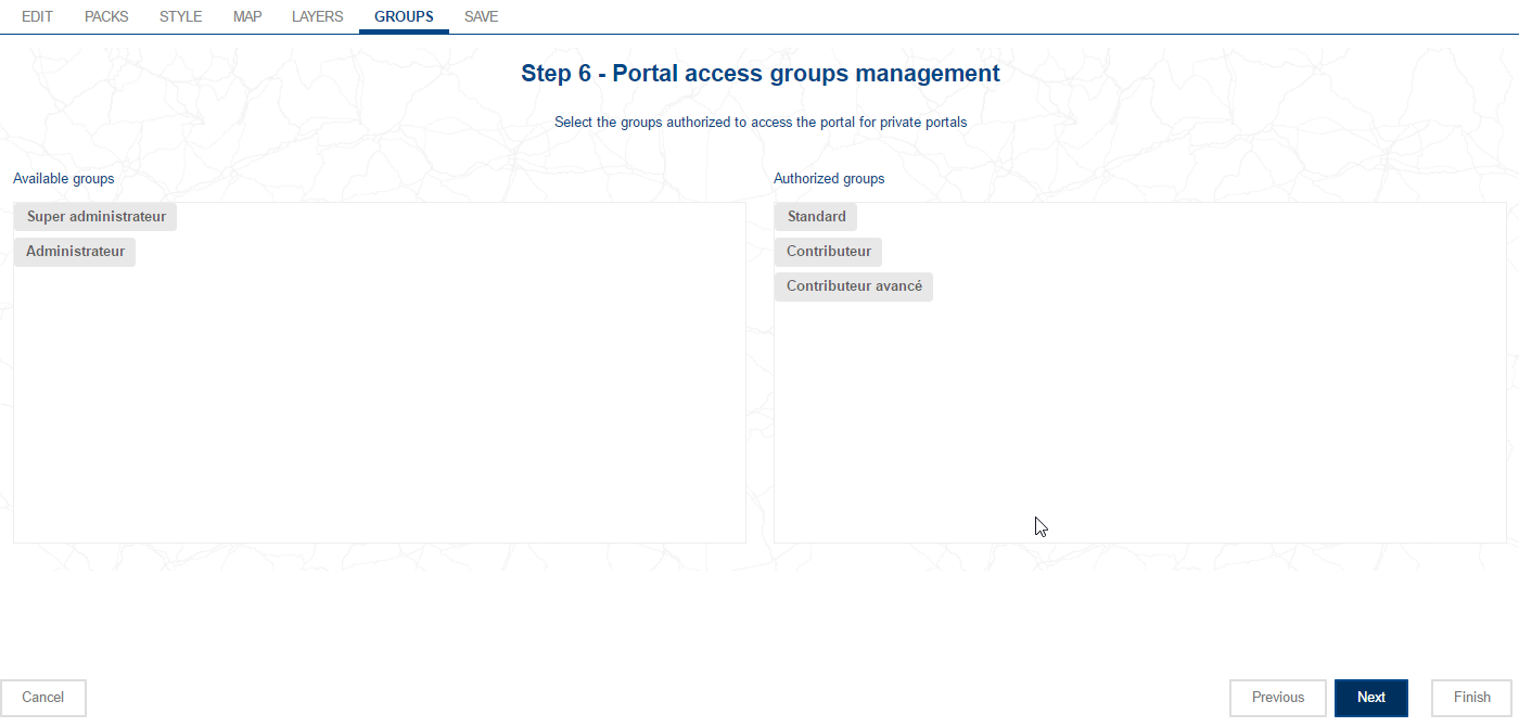
- choose user groups that will have access to the portal,
- fine tune and edit the functional side of the portal via the Composer,
For more details on mobile functionalities cf. Consult a mapping project from a mobile
The button serves to create a new project and opens the wizard.
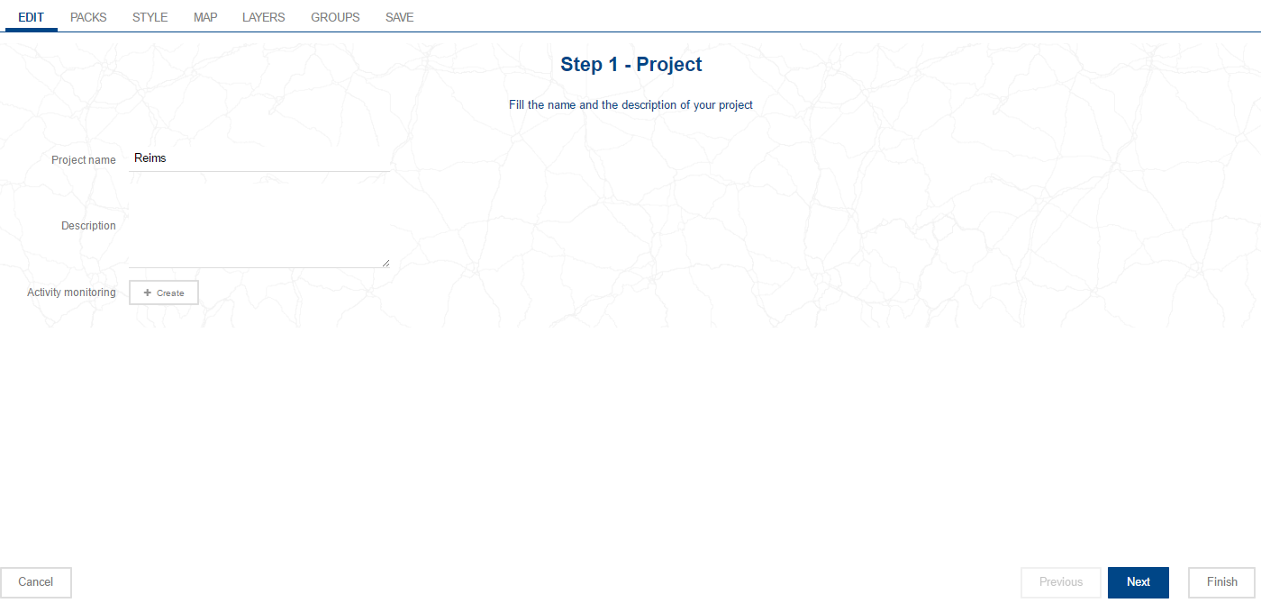
This first step defines a name for the project. It will also be possible to add a description of the project. This description will appear in the interface for handling projects.
The name of the project serves to constitute the final URL for the web site. This is why it has to be unique, and must not contain any special characters.
![[Warning]](images/community/docbook/warning.png) |
Warning |
|---|---|
|
The name of the project must be unique and must preferably not contain special characters (spaces, accents, or special characters) to prevent any possible interference with the correct operation of the application. |
Activity monitoring
Serves to measure each portal’s visitor profile (number of pages seen, where visitors come from, …). The button opens a window in which you can copy the javascript code supplied by a third party provider (Google Analytics, Xiti, …).
In every step in the assistant, there are buttons located beneath the step so you can browse backwards and forwards through the various steps:
- Click on the button to exit from the assistant and cancel the project creation in progress or any changes made to an existing project,
- Click on to move on to the next step when editing an existing project. For a new project, the use of this button is only possible having first assigned values to the parameters requested,
- The button allows you to return to the previous step, except to the first step,
- The button is available when editing an existing project; in this case, you can save the modifications made in relation to the last back-up of the project’s parameters.
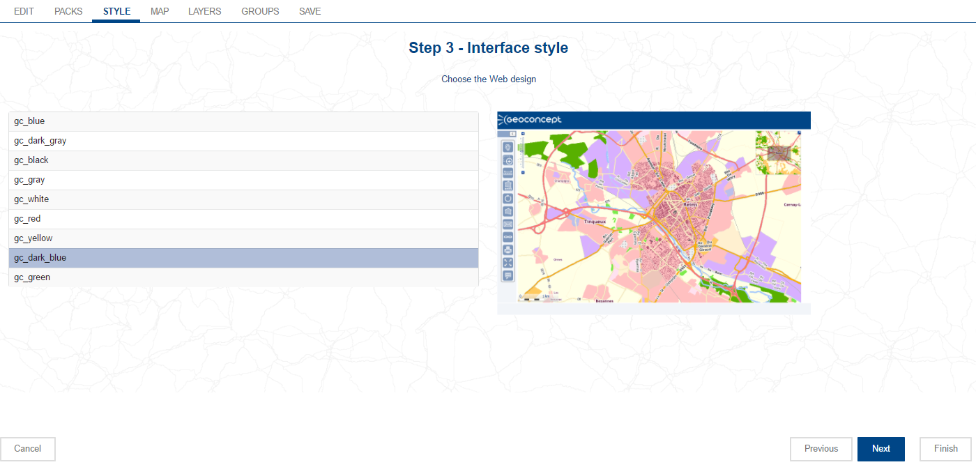
In this step the user selects a graphic design style for the web interface. By default, different colour ranges are suggested for the main page components (banners, background, inset panels, …).
Before the application will move on to the next step, a graphic style must be selected.
![[Tip]](images/community/docbook/tip.png) |
Tip |
|---|---|
|
It will be possible to create a custom style sheet via the Skin menu in the Administration tab. Some idea of CSS and an understanding of the components used in the web application are necessary to configure a comprehensive graphic design style, using the example supplied as a starting point (cf. graphic style for a custom portal). |
This step serves to select the Geoconcept map view tabs that will display in the web application, and to build the order in which they will appear in the cartographic portal.
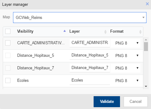
Clicking on ,the Geoconcept maps stored in the directory defined by the user displays.
When a map is chosen, it presents the various tabs that make it up. The user must then check the tabs they want to import, fill in a name and define the image format in which the layer(s) will be displayed: PNG 8, JPG, PNG 8 with transparency or again PNG 24.
From version 5.2 and upwards, an EMPTY layer is systematically suggested in the list of layers. This layer is a technical "empty" layer that is used among other things for the design of thematics.
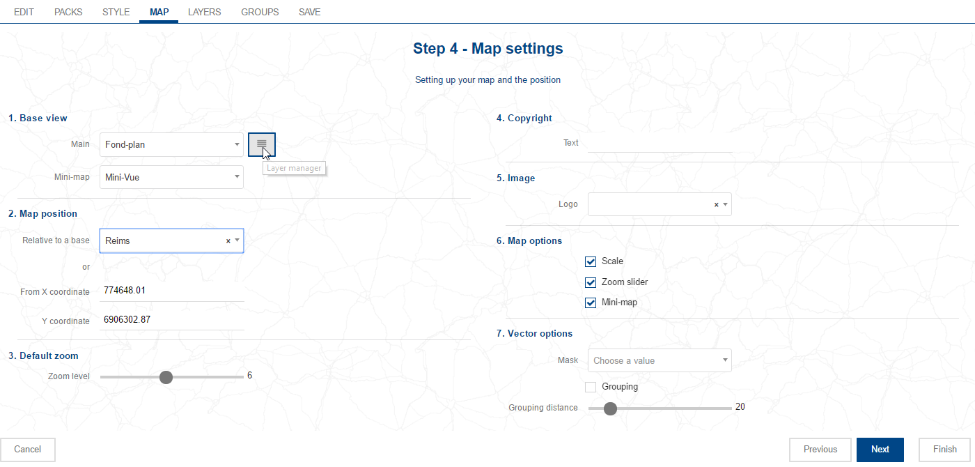
Once this action has been carried out, the user will be able to define which view tab they want to define as the current layer (the first layer that will display when the portal is deployed), and which view tab will be used as a mini-map at the top right of the portal.
When a Geoconcept map is imported, the map positions are automatically retrieved, along with their respective coordinates and scale.
If the user wants to import other view tabs in the follow-on to the project (via the layers manager), they must add them using the button.
This manipulation makes the view tabs available selected in the layers manager (next step). This also creates a layer via the view tab in the .
![[Warning]](images/community/docbook/warning.png) |
Warning |
|---|---|
|
In the drop-down menu , the geographic layer chosen will automatically be duplicated in the menu. The name of this specific layer has the same name as the source layer, but with “@Minimap@” as an additional prefix. Layers of the @Minimap@ type possess specific configurations that should not be altered in any way. If a @Minimap@+name-of-layer layer is not used, it can be deleted. |
The initial position can be chosen from the saved Geoconcept map positions. The zoom level, and the X, Y coordinates are automatically updated as a function of parameters for the position. This selection is mandatory.
A text copyright message and an image can be inserted in the web application. The administrator has the choice of adding text as copyright. They can also add an image from a stock of saved images in the web application (for more details about stored images, please refer to the relevant section of the documentation). This addition is optional.
![[Tip]](images/community/docbook/tip.png) |
Tip |
|---|---|
|
However, by default, the logo displayed is that of Geoconcept. You should add your own logo to this step to customise your web site. |
The graphic scale, the zoom slider and the mini-map displaying the global view can be enabled (by default) or disabled by checking or unchecking the corresponding check-box : they will then appear (or not) in the cartographic portal.
Finally, the 2 vector options:
- Mask
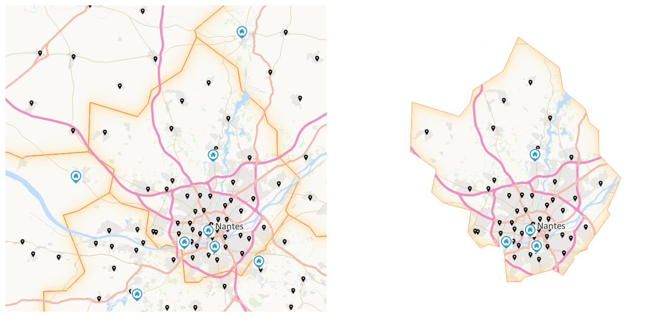
This functionality allows you to display the map exclusively on one geographic entity (department,town, … or grouping of towns or departments,…) displaying a "mask" on the other entities. Activation of this option utilises sectors (cf. the sector section).
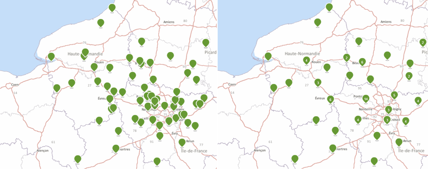
This functionality allows you to group point objects displayed in the portal as a function of geographic proximity, so as to be able to better distinguish between major concentrations of points. The Grouping distance serves to define, in pixels, the grouping distance.
![[Tip]](images/community/docbook/tip.png) |
Tip |
|---|---|
|
Activation of this functionality is applied to all point type vector layers for the portal. |
![[Tip]](images/community/docbook/tip.png) |
Tip |
|---|---|
|
(fr) Les tables où la géométrie est stockée dans un type GEOMETRY ne sont pas totalement supportées pour cette fonctionnalité, il est recommandé d’utiliser les types suivants : (POINT, MULTIPOLYGON, LINESTRING, POLYGON et MULTILINESTRING). |
![[Tip]](images/community/docbook/tip.png) |
Tip |
|---|---|
|
This step serves to select the Geoconcept map view tabs that will display in the web application, and to build the order in which they will appear in the cartographic portal. |
This step must be with reference to the choice of layers manager used in the designer. Special attention will be given to this choice of a layers manager in the Composer, in this documentation.
The order of superposition configured in the layers manager will be that which is effective (enabled) in the mapping application in the case of the advanced layers manager. The layer situated highest in the manager, and enabled, will mask all the layers positioned below it.
The procedure to follow to add a view tab to the cartographic portal is the following:
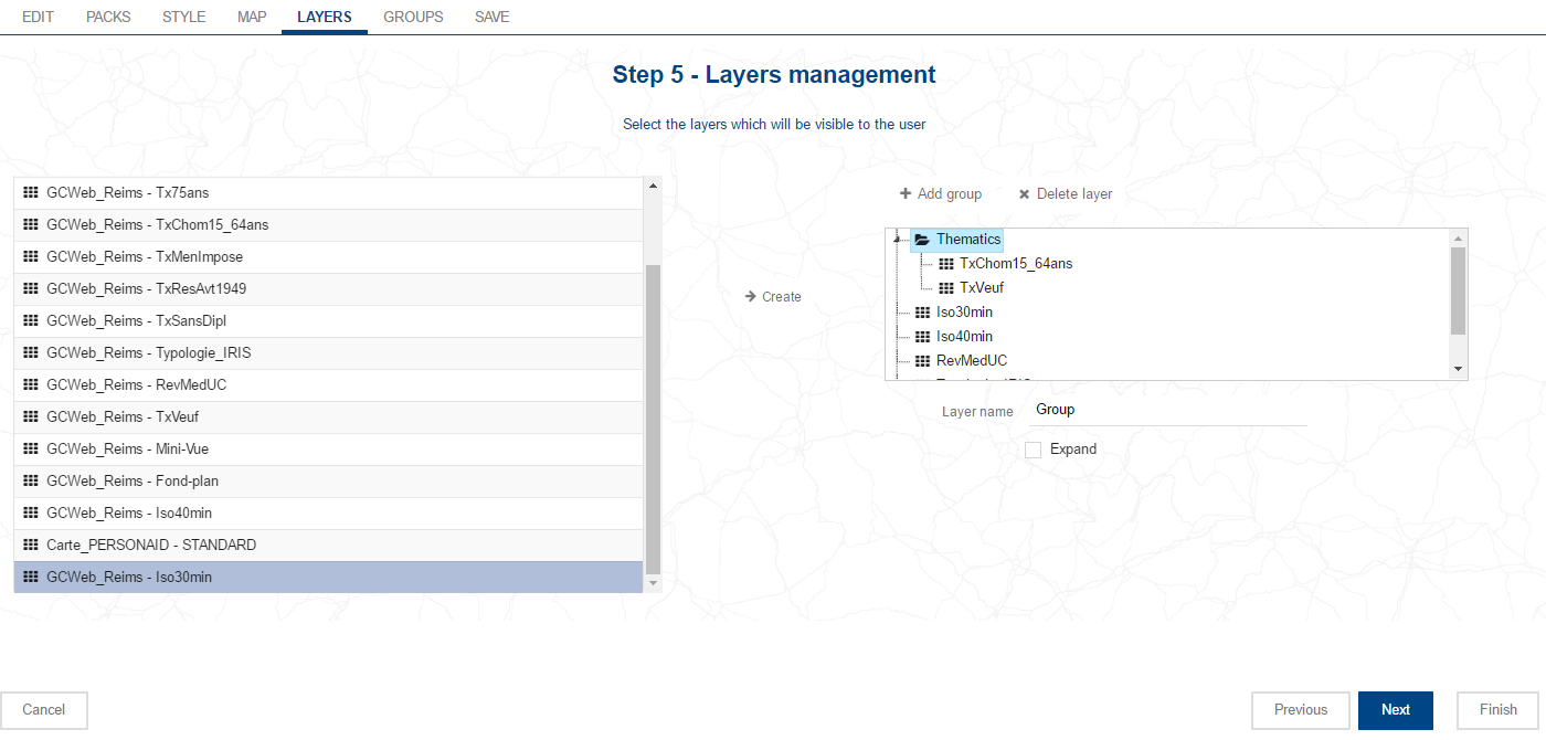
- Layers can be added by selecting them in the window on the left: they are highlighted so you can see which are selected. Clicking again on the selected layer withdraws them from the selection. At the top, the search tool allows you to filter layers on filter name, when you enter the relevant characters to search for.
- Click on to add the layer or layers selected in the layers manager.
- The order for the layers can be specified by the administrator: thanks to the mouse, it can move the layers by dragging and dropping them to the place required in the ordering.
- Clicking on the cross just beside the name of the layer deletes it from the layers manager so it will then no longer be available in the cartographic portal. A confirmation message displays.
Clicking on the layer allows its properties to be edited:
- Name of the layer: the name can be edited, replacing the name in the view tab assigned by default. Validate the modification using the Enter key on the keyboard,
- Visible: checking this check-box, this layer will be enabled by default in the layers manager; it will therefore be visible by default to the portal user on opening the portal.
- Dynamic: this option allows the user to withdraw tiles stored in the cache. The layer created in this way interrogates the Geoconcept map dynamically each time a client request occurs to supply the view tab with the current data. The advantage of this option lies in the fact that data regularly updated in the Geoconcept map will immediately become available in the mapping portal, without it being necessary to delete the cache on the server,
![[Warning]](images/community/docbook/warning.png) |
Warning |
|---|---|
|
Dynamic layers are not suited to high traffic sites. In effect, this option should be used judiciously when the likely outcome is already known: since Geoconcept Web is called each time to calculate the image to send to the cartographic portal, it is important not to request supply of an image that is too voluminous. For example, you are advised not to configure background layers to be dynamic, to avoid overloading the server. |
![[Tip]](images/community/docbook/tip.png) |
Tip |
|---|---|
|
Tiled layers that are “classical” in comparison to dynamic layers are handled in an optimum way with the cache mechanism. This means the cache is stored on the server disk, in the memory cache of the server and in the client browser. The portal is therefore no longer called to display the map in the portal when the cache has already been calculated. |
- Legend: checking this check-box will display the legend associated to this layer,
- Opacity: this is the value by default for the opacity of the layer in the mapping portal. It varies between 0 (transparent) and 100 (completely visible). This option is not used when the layer is defined to be non-visible. Conversely, as soon as the user enables the layer, it will take the value defined in this step,
Finally, the notion of group can be added to the layers manager:
- Adding a group: a group enables different layers to be classified in a single entity; a layer can be added to a group simply by dragging and dropping it on a group. Clicking on the group, it is possible to give it a custom name, and to Roll out the layer so it is open when the portal opens, and to assign Visible and Dynamic properties to all the layers it contains.
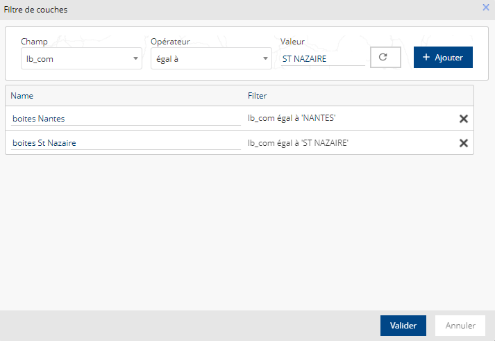
- (fr) Filtre : ce bouton apparaît lorsqu’une couche vectorielle est sélectionnée. Il permet de définir un filtre d’affichage en choisissant un champ, un opérateur et une valeur à appliquer au filtre. Une fois ces paramètres choisis, il convient de cliquer sur le bouton Ajouter ; le filtre apparaît dans la liste des filtres. Il est possible de renommer un filtre.
(fr) Les filtres créés dans l’assistant peuvent être choisis dans le gestionnaire de couches avancé.
![[Tip]](images/community/docbook/tip.png) |
Tip |
|---|---|
|
This step will only play a role in the event that the Protect option has been enabled in the project management interface. If this is not the case, you can validate this step without making any changes. |
- In the event that the Protect option has been enabled
- the cartographic portal is then protected by a secure connection page. Only a user known to the application can connect to the cartographic portal. This page makes it possible to restrict access to the users in groups that have been specified in this step.
Configuration of users and groups takes place in the Administration tab.
To add an authorised group, you have a list of all the groups available in the platform in the left-hand part of the screen. When a group is selected, it is highlighted. The and buttons can be used to move them between the left-hand and the right-hand parts of the screen.
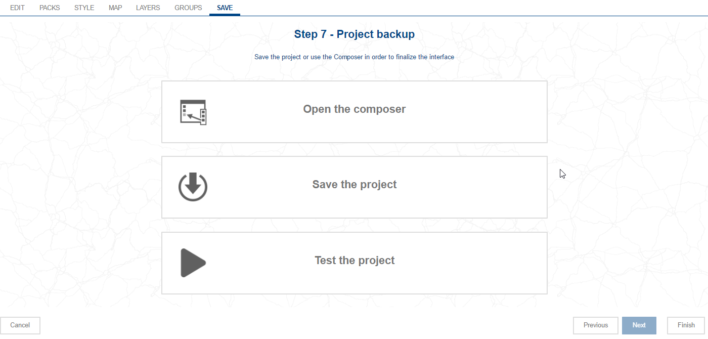
The last step of the assistant offers three possibilities to the would-be web site creator:
- Open the Composer: this button opens the Composer interface: it opens a template of the web site constructed from parameters specified in the wizard. This enables the portal creator to add the required functionalities from the library of available widgets,
- Save the project: this button saves the configuration of the parameters as decided by the creator of the cartographic portal. The functionalities available in the interface will be those selected via the choice of the pack in step 2,
- Test the project: this button opens the site in a new tab in the browser, such as it will be deployed in the current status of the configuration.
![[Warning]](images/community/docbook/warning.png) |
Warning |
|---|---|
|
The Test the project button does not back-up the project in progress. |

